Baraka.
Making investments easy. Changing what being an investor actually means.
Client
Baraka
What delivered
Branding system, Communication design, Stationery design, Brand strategy, Digital design system
Line of business
Fintech
The Beginning
It’s time to invest in your life. Join a rising MENA fintech as we shake things up in the Middle East, educating, enabling and empowering everyone to invest.
The baraka app is the tool to empower investing. It’s the knowledge, community and potential that old-school investing methods lack. It’s confidence – not just to invest, but to become an investor. And we’re changing what being an investor actually means. Access to markets is no longer reserved for the elite. Financial education is not just for those who pay. That’s while we are creating a super easy and understanding design language for this journey.
About the project
Baraka is the tool to empower your investing. It’s the knowledge, community and potential that old-school investing methods lack. It’s confidence – not just to invest, but to become an investor. Access to markets is no longer reserved for the elite. Financial education is not just for those who pay.
Client needs
To achieve Baraka’s goal of becoming the main investment platform, representing Dubai FinTech community both locally and abroad, turned the brand in 360 degree and created future tech approach. Consisting of bold approach that reflects the ambition to bring together talent, expertise, knowledge, and infrastructure to build the next generation financial services.
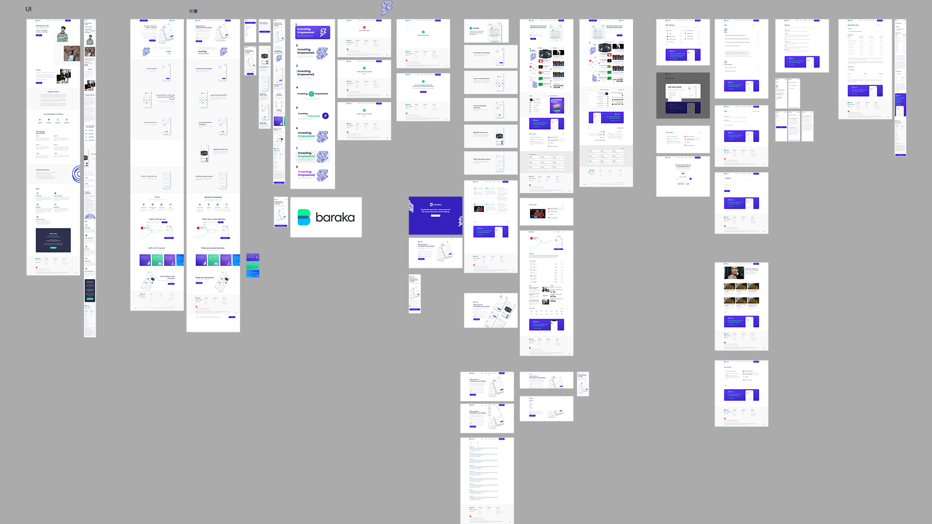
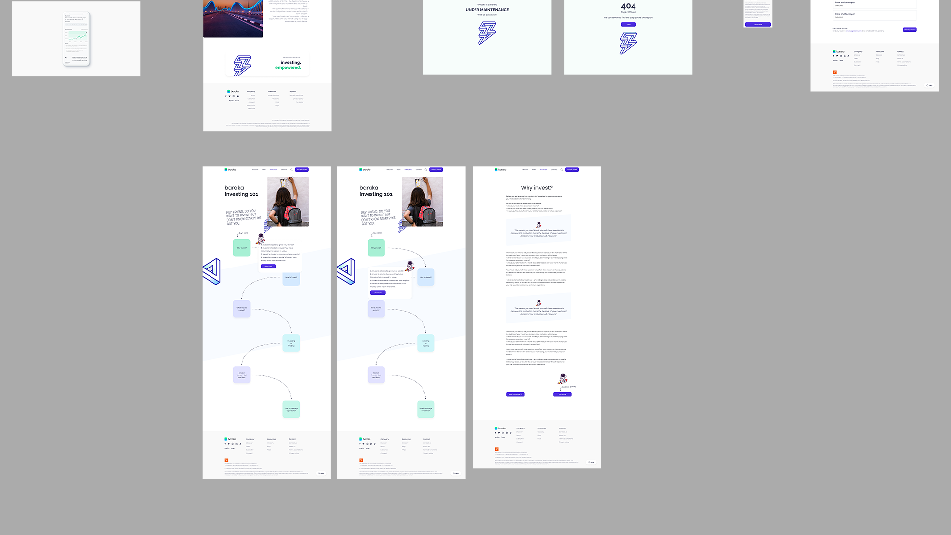
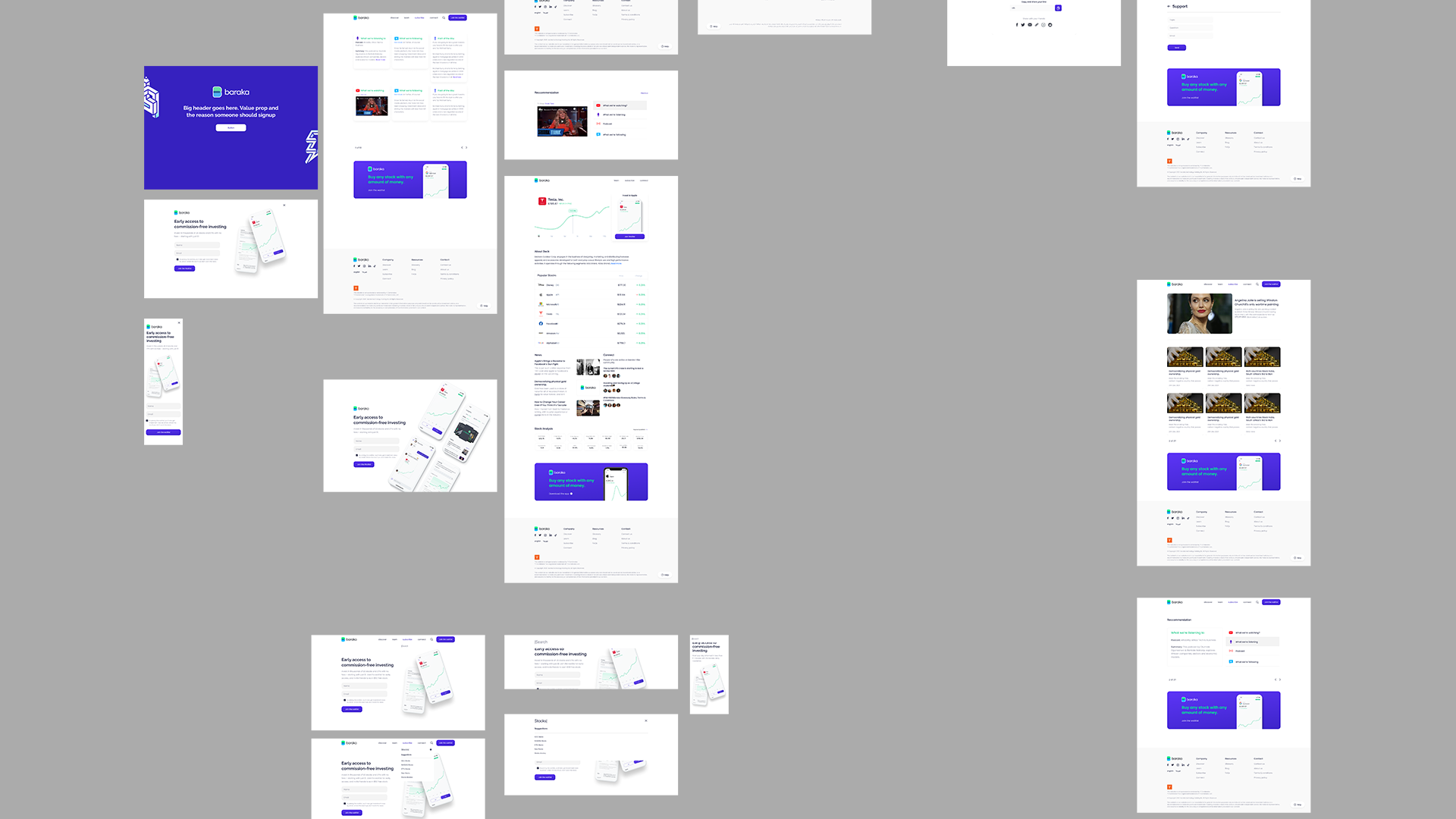
The Process / Immersion
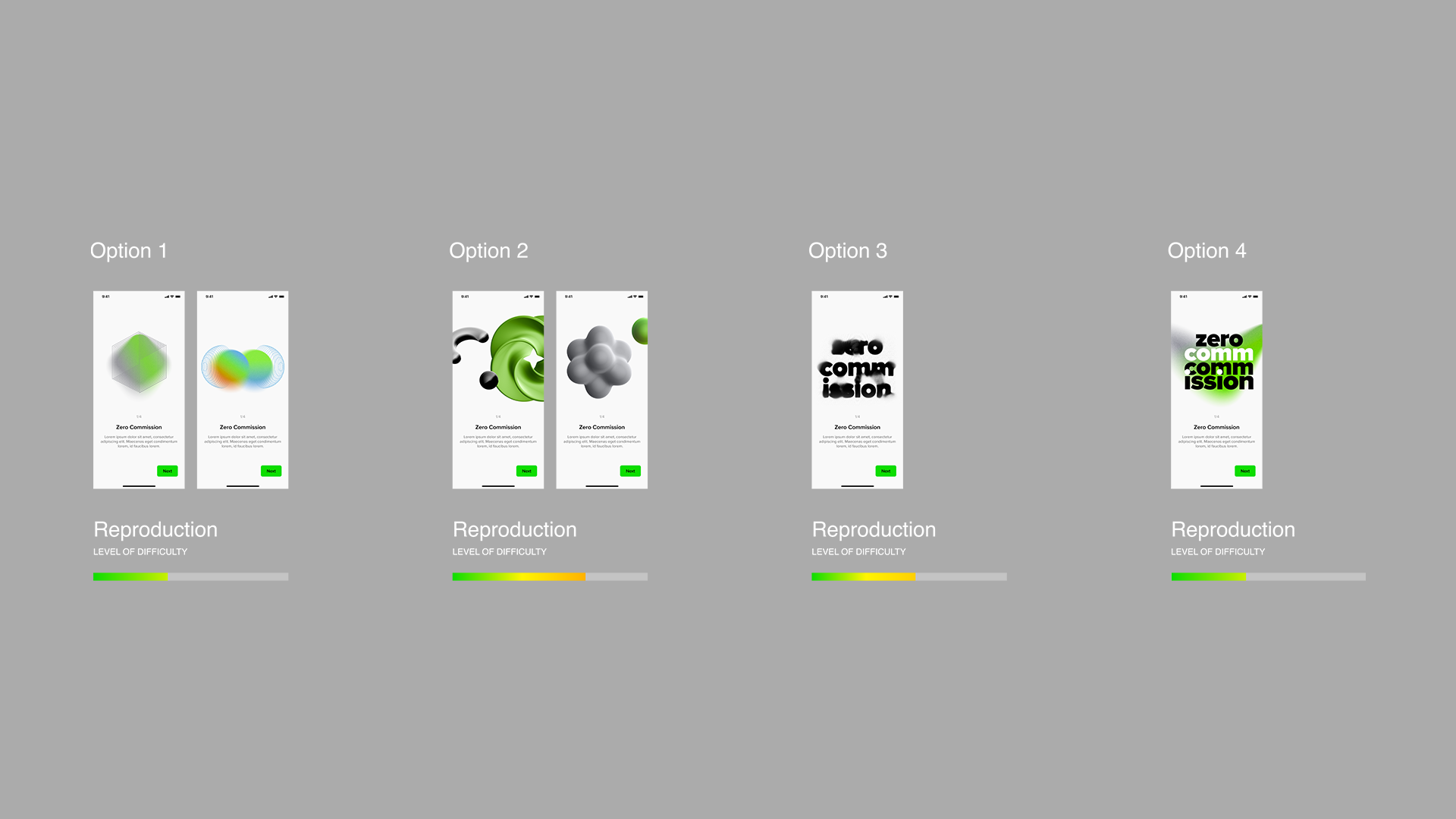
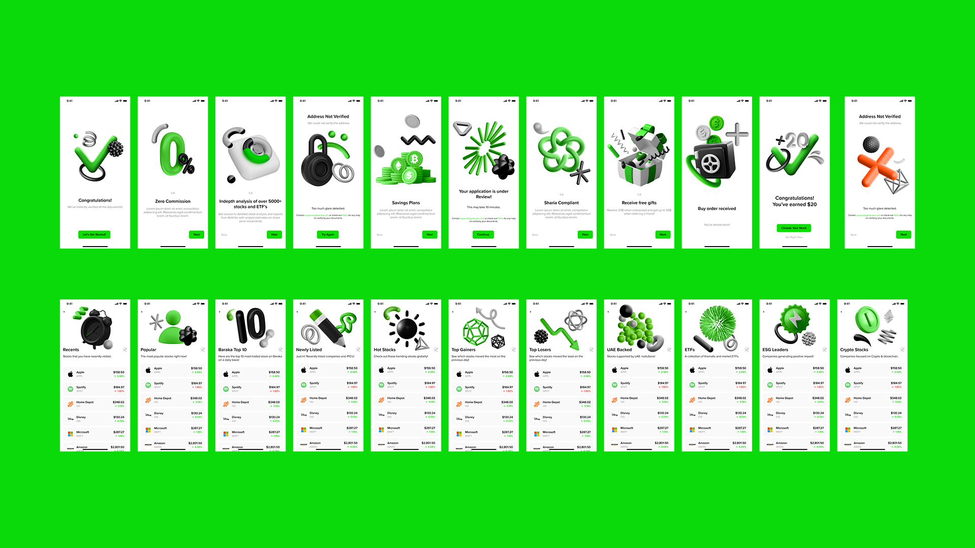
Beyond the complexities of creating a multifaceted brand, there was a core challenge to solve: to define Baraka as an investing platform that stands on its own, not a ‘light’ or ‘casual’ version of its Wall Street. We worked together to translate the “Empower of investing” positioning statement of Baraka to a visual language that subtly communicates this message to both its core clientele and potential customers.
Design value
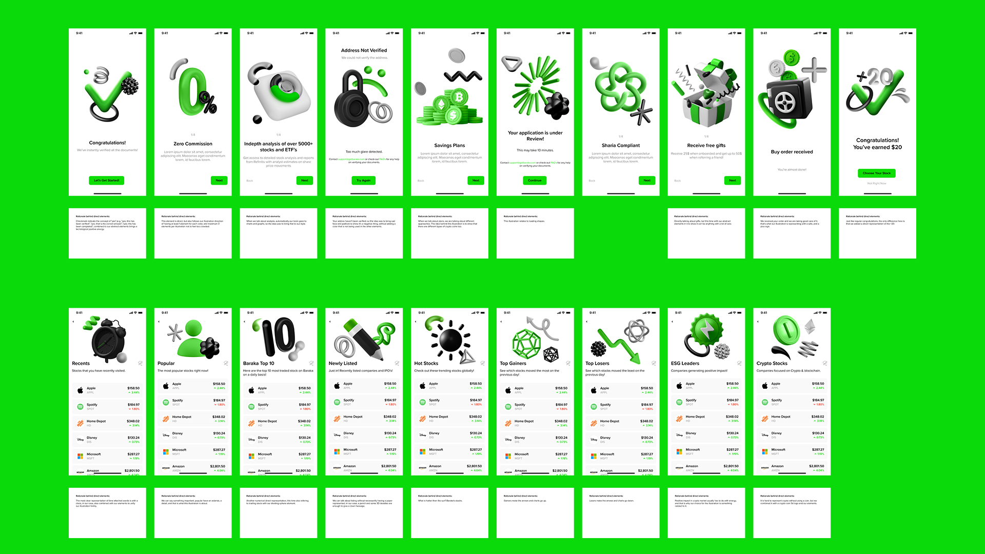
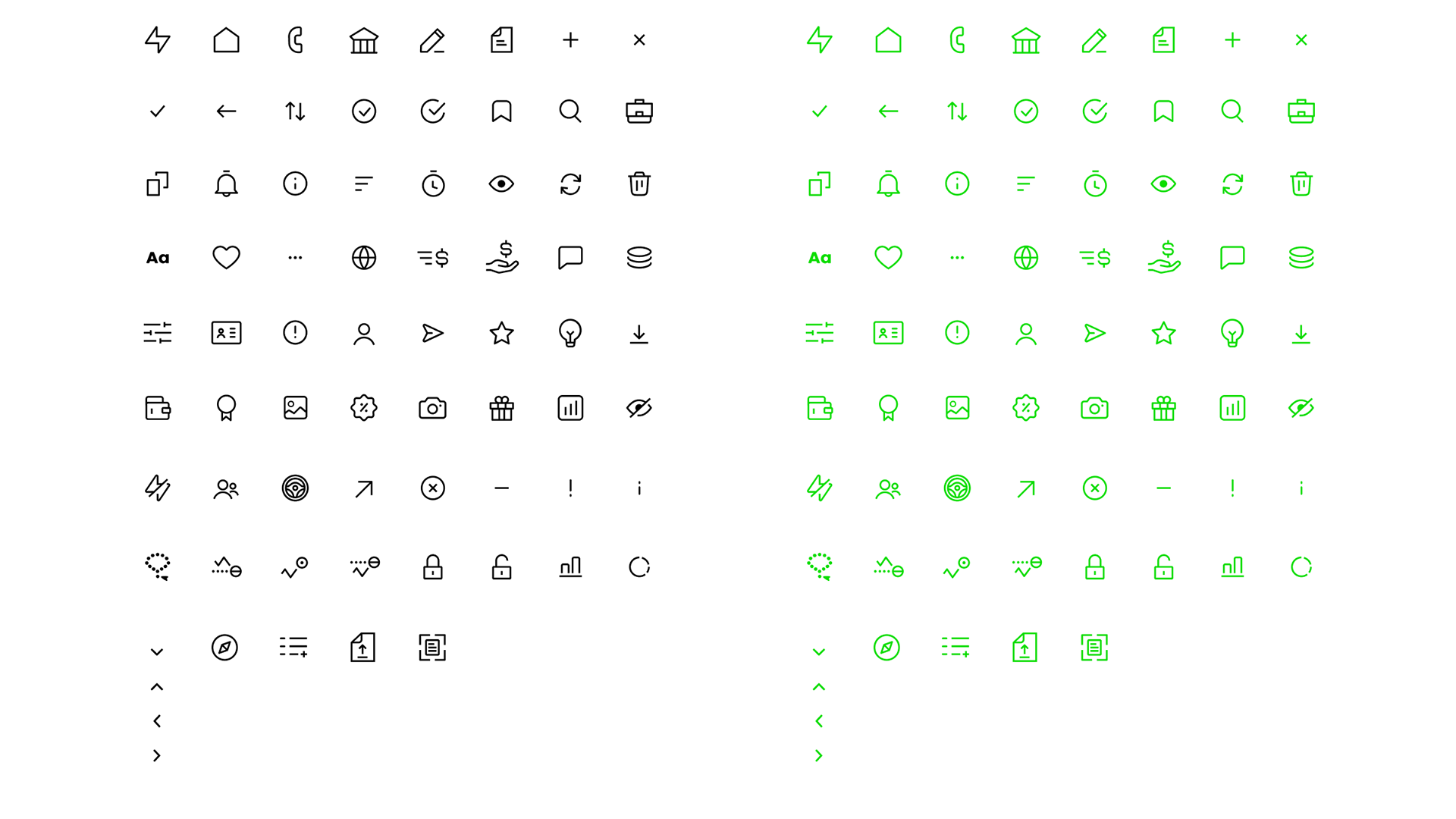
Baraka’s brand logo was developed based on the company’s purpose and objective of integrating and empowering investing. It’s modern, sans serif typography contrasts with the bold symbol, representing brand’s dynamism and flexible personality.
The symbol of the facetated B is quite significant for the conception of Baraka’s identity. That’s because, as the brand proposes, the B appears to be a tridimensional and coin-like element, while also super simple and balanced.
A tagline helps highlight our company’s brand to the public. Its most important aspect is to ensure that it is memorable. It also helps setting us apart from other investment platforms.
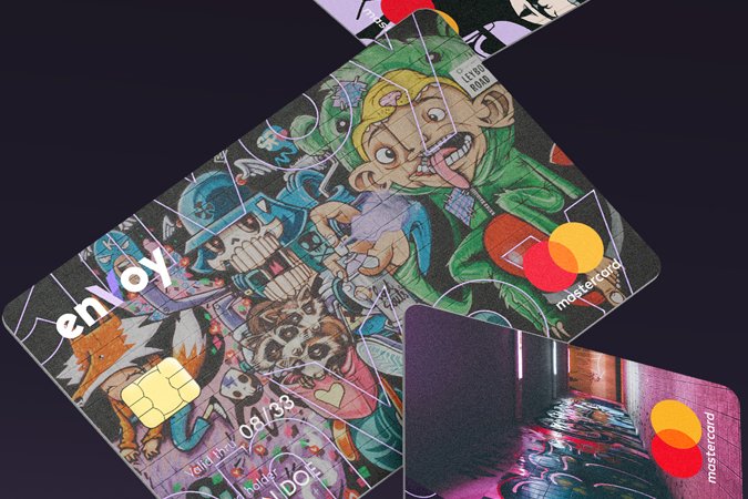
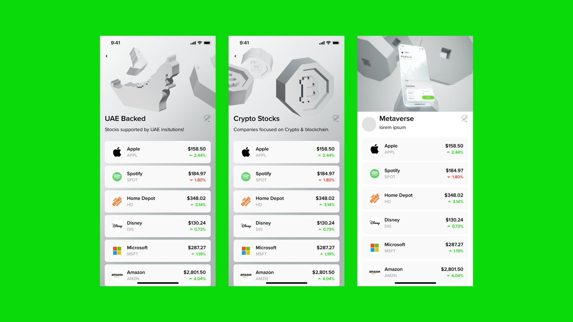
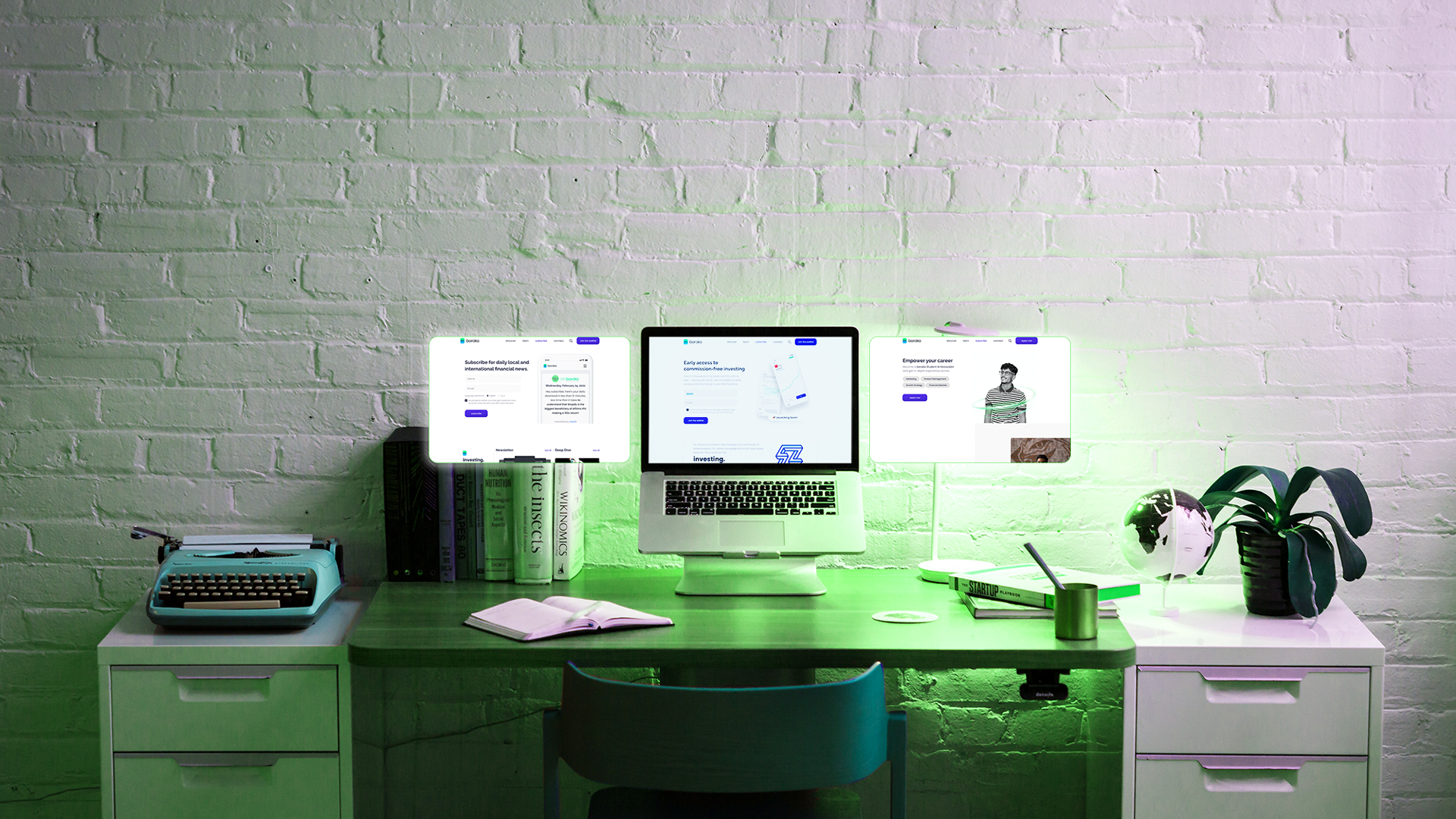
For the photo treatment, we are aiming for minimalistic product style. Successful branding involves more than just adding brand assets to your app. Great apps express unique brand identity through smart font, color, and image decisions. Provide enough branding to give people context in your app, but not so much that it becomes a distraction.
“When I look at this brand, I suddenly realise everything I’ve been trying to say, now we have a way to express it.”
— Sam L. / Product Director, Baraka
Summary & Impact
The result is a clean and confident brand that eschews the slick, trendy norms of technology branding in finance gap and personality. The visual system boils down what the product does to a simple analogy which can stretch across the required markets and cultures. The strategy and brand engage consumers and merchants, stands out in crowded digital and physical POS environments and ultimately brings together dozens of local e-wallets and financial institutions, positioning Baraka as a truly fintech company.